Neutral designs in homes and commercial businesses are all the rage right now. With the popularity of palettes of gray colors, full white kitchens, and simple/minimalist looks, everyone is gravitating towards the neutral design palette. Walking into a space and seeing clean white lines with unfinished wood tones creates a sense of brightness, harmony and balance. The clean crisp look of a neutral space is almost something you can smell like clean white linens hanging up to dry. Designing in a neutral palette can be difficult but not impossible when determining if and when to add pops of color.
Do you lean towards dark grays? You may be more into cool undertones. Do you prefer warm espressos? You may lean towards warm undertones. This will be important to understand when designing your space.
The great thing about designing in a neutral palette is that you don’t have to stress about all the colors in the room matching. The best way to build a neutral palette is to start with one neutral piece. Maybe it is the cream couch you bought or the gray paint you love. Once you identify that piece, start to build from there. If you love the light gray walls you just painted, try pairing it with a charcoal couch.

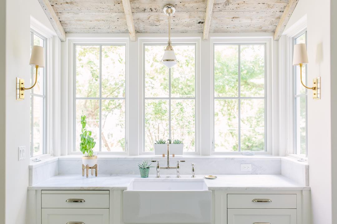
Source: Kate Marker Interiors
Add in elements from the outdoors. Again, if you are building off the gray palette, find times where you can incorporate a gray slate tile or gray stone into your design. If you’re building off a warm beige couch, how can you incorporate unfinished wood that is the same tone into your design? Could you add raw wood bookshelves or tie in some natural marble floors?

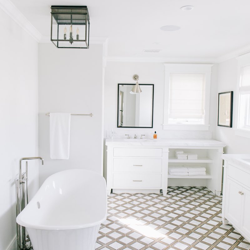
Source: Kelly Nutt Design
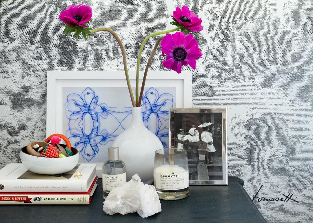
Add in texture. Create interest by mixing high gloss items like metallics into the space. The difference in sheen will give a lot of visual interest. Don’t forget that you can include various textures or metallics by adding a pop of wallpaper. Just like I mentioned above, similar to bringing outdoor materials inside, adding in texture from tiles or stone gives more dimension to the space. Texture can be layered with throws, rugs and other textiles. Mixing the same color in different textures really creates interest and no pieces, even though they may have the same undertone, will look the same.

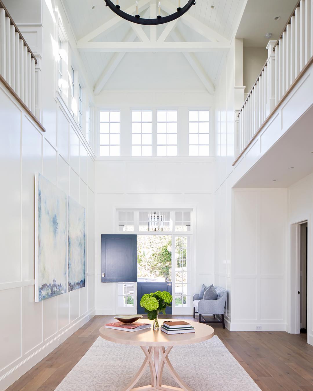
Source: Brooke Wagner Design

Source: Hannah Crowell
Designing in a neutral design allows for specific pieces to pop. Maybe you want to make one bold statement by designing your bedroom in all neutrals and creams, but then to make a real splash, you add in a bright navy chair. The chair will work nicely with all the other neutrals in the room and will really stand out with the neutrals being your backdrop.
I find that neutral palettes always seem to give a sense of calmness or harmony whenever done properly. A monochromatic design is a good starting point to refreshing a space, and you can always add color later on with fresh furniture or accessories.
Happy Designing.

